Many of my blogposts have featured my own photos, and I'm proud of most of them. Not only do they describe the content well, they also look pleasing and hopefully intriguing, what with the various angles that I've used to take pictures.
Yet I am nowhere near a good photographer, and I've taken many photos that wouldn't otherwise make the blog due to either not being that good, or since they wouldn't be helpful. Either way, here are three that I'm not proud of that could have ended up on the blog otherwise. Sorry if this comes off as whining.
Blocking the Sun
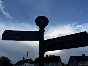
This photo was intended to be of a signpost near a park that I'll publish a blog on soon, but I made the mistake of positioning it directly in front of the sun. As any physics student could tell you, the light coming from the sun at this angle is blocked by the signpost, so you can't actually read anything off it without looking up close. It's a shame, because the photo doesn't even look that bad - if anything, it sort of looks cool with the sky behind it. However, when a photo is intended to have a specific purpose and fails at it, I wouldn't choose it. A similar issue affected my lead photo on the West Sutton miniblog (though not as bad) - as it turns out, both photos were taken on the same day, yet I didn't learn my lesson.
Too Dark
This photo isn't even that bad - it's a night-time shot of a building along a main road. The blurred cars give it some charm, and the stroke of light from the lamppost looks great (this is probably as, this being the autumnal UK, a result of rain).
The only problem is that most people probably wouldn't have a clue what this building is off the bat - this is partially due to the angle, as well as the lighting, which makes it even more difficult to be guessed. It's Woodside station, if anyone's curious. It's not a disliked photo, but it certainly would go unblogged otherwise (unless I really needed a photo and I had no others lying around).
A Bit Blurred (and portrait)
I suppose a photo of the Pantheon counts as what I'd describe a good use of portrait. But I don't know - compared to other photos that I've taken of the building, this one is less satisfactory. Perhaps that's due to the blur, combined with poor lighting and angle. Compared to the photo I put up in my blog on additional travel photos, this one looks substandard compared to it.
Obviously I'm not trying to sound inflammatory - if you prefer your photos how I dislike them, that's great (not least as they're probably better taken too). However, I feel as if these three photos could have been better, and as such, you won't find them elsewhere on this blog (unless they've slipped past me before).


Comments
Post a Comment